
Chicago Convention
& Tourism Bureau
.
So what does an art director do with an interior design degree? Utilizes those skills, of course! When the Chicago Convention & Tourism Bureau needed a complete overhaul on their marketing materials for convention space, I was the one the agency called on to lead the project. Going on location, touring the facilities, reading and revising floor plans to accommodate changes that had been made to the existing space.

I designed a series of metallic folders and complimenting floor plan brochures to meet the needs of potential trade show event planners. The silver series introduces everything the city has to offer, copper and blue provide more venue details. Eventually, McCormick Place West (left) was introduced.

An introduction to the city of Chicago convention venues, the silver folder included the Attractions Not Distractions roll-fold brochure and all-encompassing floor plan brochure.

The Attractions Not Distractions brochure was revolutionary for its time, being the largest sheet of paper possible to be created as a roll-fold brochure. Panel by panel, as you open, a new Chicago amenity is featured.

This is the only purely panoramic photo in existence of Navy Pier. At 3,300 feet long, technology at the time did not allow for such a photo without a fisheye lens. The is an example of my stellar Photoshop skills, piecing seven photos together. Ask me to tell you my photography story of how I had to walk the Chicago Locks to make sure this was going to work first!

The McCormick Place folder featured one uniquely cut pocket resembling the “M” that held three floor plan brochures, one for each building.

Second in the series of McCormick Place brochures, the South brochure is the largest of all the venues. The piece opens with a double gate fold featuring elegant architectural photography of the interiors.

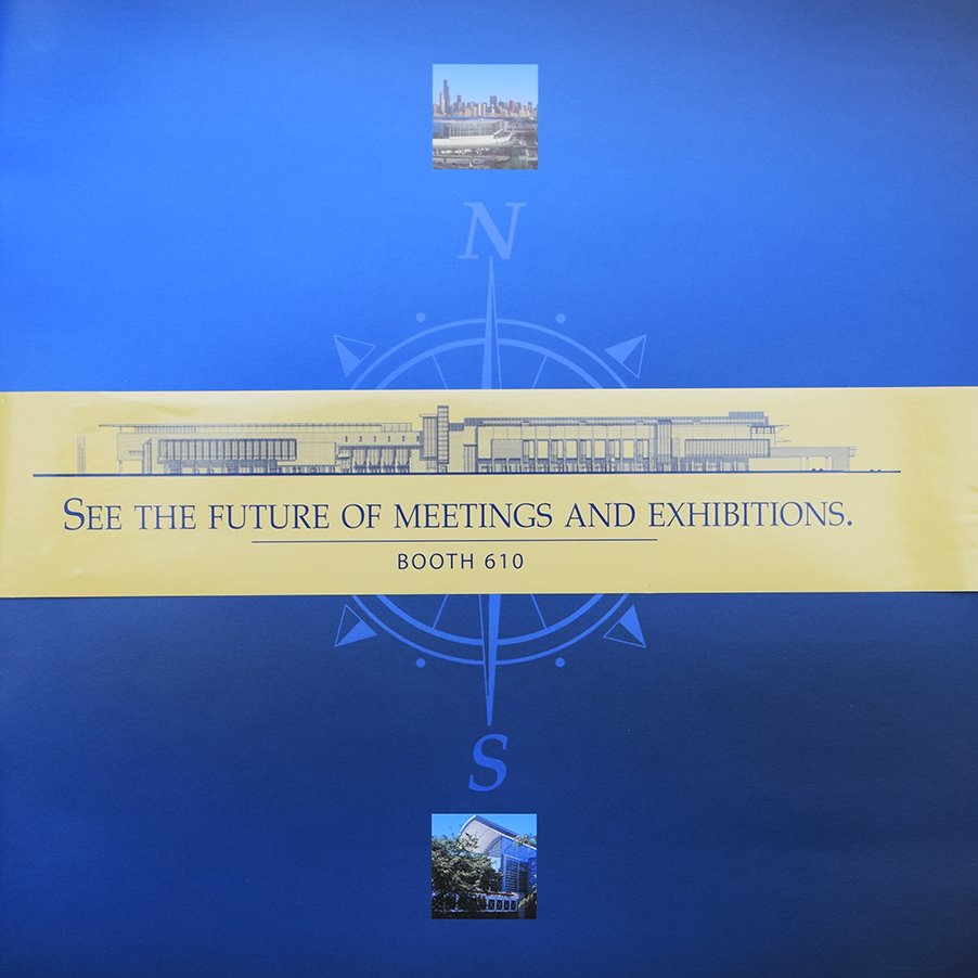
Phase 2: When CCTB broke ground and plans were in the works for a new convention center, a new direct mail campaign and floor plan brochures where developed to start booking the new state-of-the art facility.

The inside features stylized floor plans and elevations. I converted the original CAD drawings to Adobe Illustrator to add color and stylization.

Inside the double gate fold:
I created this map in Adobe Illustrator, painstakingly locating each and every hotel on this map. To this day I remember that addresses on the south or east side of the street are odd numbers.

Navy Pier is the oldest venue available for exhibitions with CCTB, having landmark status. This brochure was fun to create, juxtaposing historic photos of the Pier against modern day photos. Upon first opening the brochure, you see the illusion of the newly renovated Pier flowing into the original Pier photographed in 1916.

The unique aspect of the Navy Pier folder was the custom die created with the wave cut folders replicating the waves in the A of the logo, paying homage to its location on the lake. Additionally, I designed new identity materials for Navy Pier with watermarked stationary and cards.

McCormick Place North is the first of three in the series of McCormick Place brochures.

Lakeside Center is the third in the series of McCormick Place brochures, and the end of Phase 1.

The McCormick Place West brochure features detailed floor plans grommeted to the back cover for easy access.
— ROLE
Art Direction
Photo Direction
Graphic Design
Consultation
Floor plan updates
— AWARDS
2002 BMA Bronze
Tower Award
Working with the Chicago Convention & Tourism Bureau was truly a collaboration and team effort. When the agency was hired, all seven art directors worked together to submit new logo concepts. My colleague, Dave’s idea was chosen. The work was spread among the department, showcasing our talents. Dave, having won the logo contest, worked with the advertising campaign. Having just completed my interior design degree, I was excited to take on the convention materials, tackling the challenge of stylizing their floor plan brochures and handling the facility photoshoots.